Bank of Pontiac
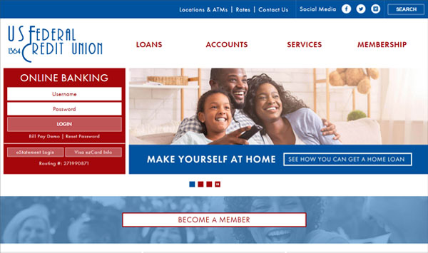
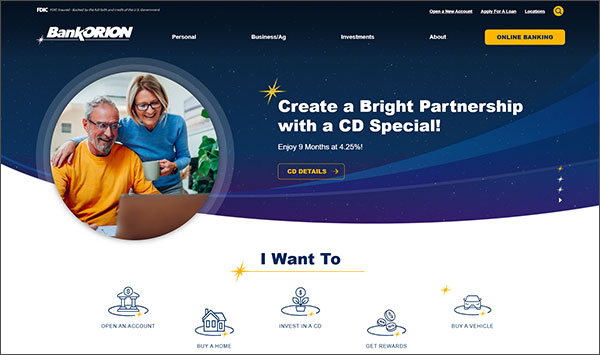
Website RedesignBank of Pontiac has been a longstanding customer of LKCS. Their old site was one that we created, but they needed us to give it a facelift and satisfy a few new goals. Their main goal was to make the website more organized and have less clicks for a user to find what they needed. They also wanted a way to direct customers to their local branch. This was accomplished by adding a local branch callout section that points to the branch closest to the customer’s location. We also used clear call to action buttons on the homepage, as well as bright colors to divide up content. Along with this, a curved shape theme was inspired by their branding and used throughout the site as both design elements and custom bullets. It was a pleasure to work with Bank of Pontiac on this website design, and we look forward to working with them on future projects.


