Better Banks
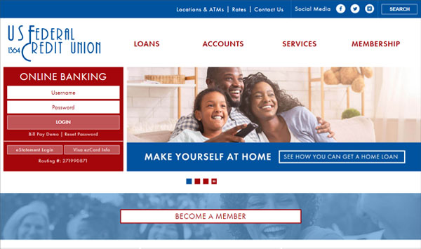
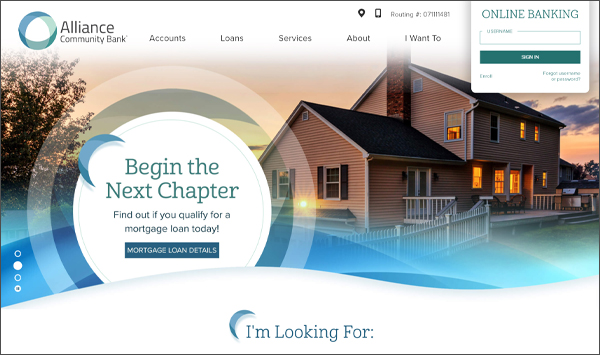
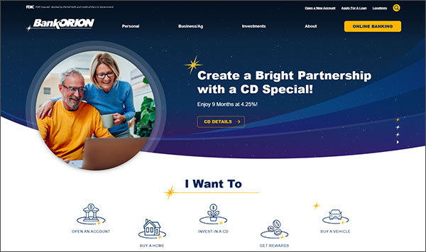
Website RedesignBetter Banks wanted to update their website to be more mobile friendly and easier to navigate for their customers. We chose a flowing design based on the curves and shapes within their logo with large, bold elements. This utilized callouts to often used services, rates and up to date news and information articles. We incorporated the angled "waterdrop" shape through the site in the images and bullets tying in with their logo. On the inside pages, we continued the use of flowing shapes to help give the website a free-form feel. Large callouts were placed to draw attention to important facts, quotes, and statements. We really enjoyed working with Better Banks and bringing their ideas to life.
Better Bank's website has gone on to win recognition from:


