Hibbing Cooperative Credit Union
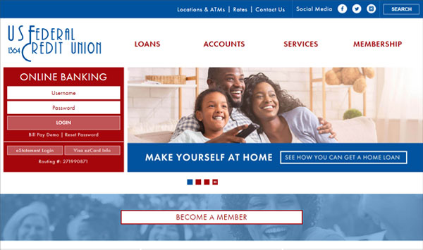
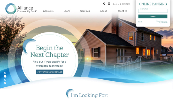
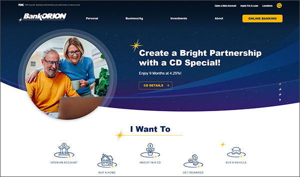
Website RedesignAfter two decades with the same website design, Hibbing Co-op Credit Union was ready to upgrade their website's look and platform. LKCS delivered a complete redesign that combines sleek, modern style with effortless functionality. This project's goal wasn't just about aesthetics, but a complete overhaul aimed at improving user experience through:
Organized Navigation: We restructured the website's navigation to group financial products and services together so they are simple to locate.
Easy-to-Follow Content Sections: We created a template for inside pages to follow a familiar outline. Content is segmented to make information accessible and straightforward. The design also helps pages which have little content appear to have more helpful information.
Clear Call-to-Actions: To ensure members or new prospects can take the next step easily, we included clear call-to-action buttons throughout the site. They serve as a guide for users to get in touch with the credit union.
The new website isn’t just user-friendly; it’s also easy to maintain. We migrated the website from an old CMS platform that was difficult to make routine updates. Now, using Progress Sitefinity's platform and LKCS' Tool Suite, updating content is a breeze and can be done on a regular basis.
Our designers didn’t stop at functionality. Drawing inspiration from the shape of their logo, we incorporated geometric shapes and wavy dividers to bring the brand to life. We utilized typography to add interest, support headlines and to be visually engaging.
We enjoyed upgrading Hibbing Co-op Credit Union's digital presence with a design we can all be proud of for years to come.
Hibbing Co-op Credit Union's website has gone on to win recognition from:


