Homeland Credit Union
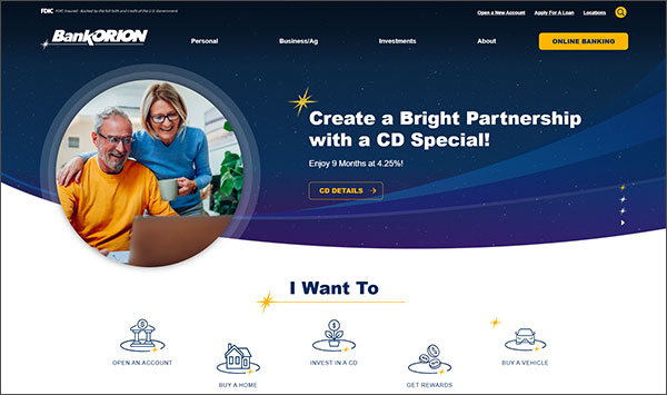
Website RedesignOur website redesign highlight of the month is another repeat client, Homeland Credit Union! Our goal was to provide a brand refresh with a modern, "outside the box" and forward-thinking feel as much as possible, while maintaining the familiarity of their original brand. Our main goals were to provide a better experience with loan applications, online account openings, payment options, easy accessibility to forms.
To do this, we presented Homeland with a solid "splash" page which immediately addresses these topics. We also created a custom slider for the user to interact with to provide instant savings on featured products. We added a fun star animation when hovering over quicklinks and also designed a lighthearted popup with an email signup form. This was our second redesign for Homeland and we are thrilled to continue our relationship with them!
Homeland Credit Union's website has gone on to win recognition from:


