Millstream Area Credit Union
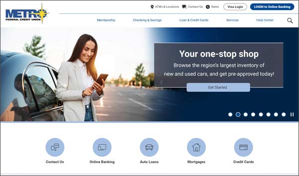
Website RedesignMillstream Area Credit Union asked us to redesign their website to follow their current branding as well as create a modern, eye-catching look.
Website Design Changes
There are several ways we accomplished this. First, we used the star icon from their logo throughout the site. This included a custom star bullet for the copy. We also kept a similar color palette to their logo’s branding, utilizing shades of red and blue. Lastly, we incorporated a wave hover effect for the buttons and curved shapes throughout the site to further emphasize the brand.
On the inside pages, we presented the content in a way that would be easily navigated by users. One way we did this, was by organizing content within accordions. That way a user could easily scan a page, and open up the accordion to view more information.
We are happy with the result, and it was a pleasure working with Millstream Area Credit Union on this project!
Website Design Award


