TTCU Federal Credit Union
Website RedesignThis is the second website in a row we’ve designed for TTCU. They returned wanting a more modern look, a fantastic user experience, and to focus on the success of members and potential members.
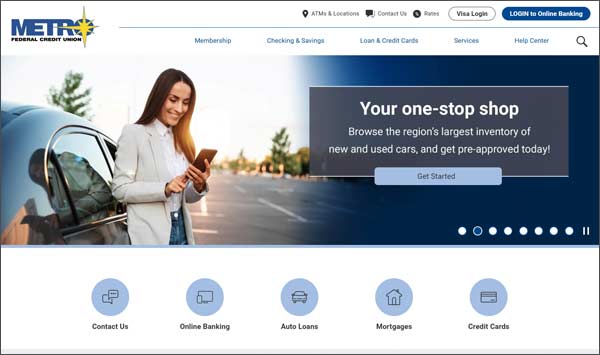
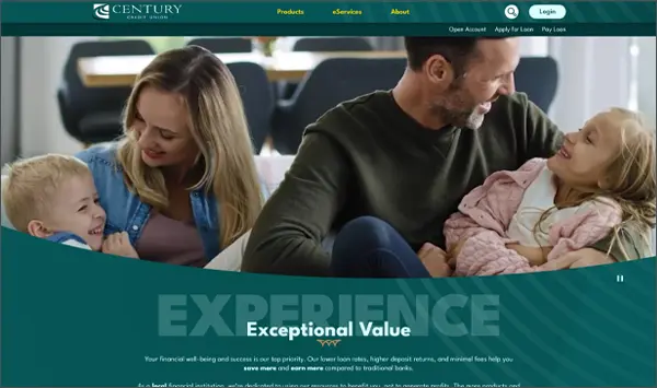
We created a large hero banner that grabs the user’s attention. Featured rate callouts that have room for supporting text and some icons of featured products and services. We focus on members and potential members through the use of education materials, featuring members and their financial stories, and using frequently asked questions throughout the website.
To help support Spanish speaking members and potential members, the website can also be translated to Spanish.
Website Design Award
TTCU Federal Credit Union's website has gone on to win recognition from:


